Wednesday, 30 November 2011

Photoshop Edited

Photo Edit 1


This is the image I have selected out of my various photos from the photoshoot. I wish to use this image on my front cover. Although the lighting was good I still felt it wasnt light enough and I could edit it to make it brighter to stand out alot more.Also having brighter lighting relates back to theme of partying. I used Photoshop on the MAC's to do this editing. I brightened the exposure of the photo which also brightened the Ibiza Rocks logo on her top which now contrasts alot more. I placed in a spot light and flare to emphasise the fact that Lucy Codd is the main subject of the story and magazine. I chose this photo out of all my other photos because I believe the angle of the photo and the eye contact is good because it looks really direct. 

Photo Edit 2


I chose to use this one picture out of my variety that I took as I believe the angle of the photo is good because it doesn't show he is any bigger of smaller than anyone. Scott is rising to fame but is still the laid back boy from Surrey. In the photo I tried to show he doesn't feel any bigger and better than anyone because of his sudden rise to fame. The expression I caught shows his cheeky chappy side to his personality which portrays a true and loveable boy towards the reader. I chose to turn the photo into black and white because I have put it onto a very bright and vibrant collage of photos which If the photo was in colour he would lose the contrast and show that he is in front of these. By doing this I tried to portray the fact although hes the main subject in front of all these collage of photos, his festival and partying lifestyle is still there and will never be lost. 

Tuesday, 29 November 2011

Pencil Sketches - Plans


I firstly created a pencil sketched plan of my front cover for my music magazine, I started creating and designing it by following the codes and conventions of a music magazine for example the mast head at the top. I looked at different magazines in shops and was able to see by using a hot spot in the top hand corner it attracts the eye of the reader and by putting in a freebie this persuades them to pick it up and buy it. I designed it follow the codes and conventions but also designing how I would want my own to look and reasons why it would look more effective. 


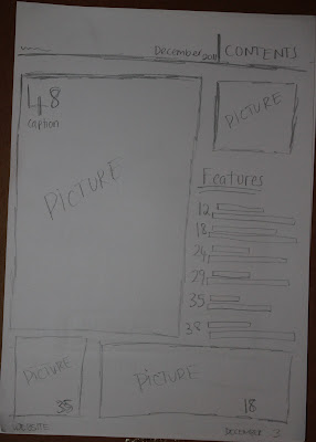
I then went onto sketching out my contents page doing the same; following codes and conventions but also challenging them by putting my own style into them. I decided to use more than two pictures on my contents page because my target audience are more attracted to looking at pictures than text therefore this will help to get them to read the different stories from the pictures instead of a long list of features which can be seen as slightly boring. 


Lastly I sketched out my plan for my double page spread on the left side I am introducing the 'new upcoming artist' so I use a photo stretched across the page with the headline and subheading below then on the page across to that I am having the article down the left hand side and a block out with 'Twitterview' questions and answers. The background I am using a collage of photos which I have taken.

Monday, 28 November 2011

First Draft Of Double Page Spread Article

This time last year, Scott Kerner, 23 was a typical festival goer heading down south in an old bashed up minibus, packed full with a bunch of mates, all gearing up for Britain’s largest music festival weekend, Glastonbury! The whole weekend consisted of muddy camping, ALOT of drinks, girls and of course the fantastic line up of Glasto that definitely never fails to please. Hopeful singer, Scott, played in various little clubs around the country leading up to summer 2010 along side his day to day job as a builder in London. Little did he know what 2011 would bring him. A year on, Scott has been given an amazing opportunity to perform on the Pyramid stage at Glastonbury in front of hundreds of thousands, Thanks to Example for having Scott as his special guest on his UK tour. He explains how mad his Twitter and Facebook has become and is shocked how quickly it has happened. 'Don't wanna sound too cringy haha but im just so happy to be able to perform to such an amazing crowd of people who are just like me, travelling down to Glasto, wellies in hand, drinks, tents ah, I aint gunna become snobby I love my life, my mates, my hometown. Can't wait to perform mann, Just wanna thank Example. Top man'. Its rumoured Scott will be performing to the crowd his new album, 'Never Ordinary' which contains dance classics with a unique and different twist that’s never been done before. We'll take your word for it!! You are able to pre order Scott's album on iTunes now and it is released on Monday. Were looking forward to watching Scott's performance on Glastonbury 2011, remember Pyramid Stage BBC 2, Saturday 5.00pm, TUNE IN!


I decided to write out my double page spread article before taking photos because when we went to NME they stated that they firstly wrote out the article then took photos which are relevant to the story. This made sense and seemed a better idea therefore when it came to taking photos I knew exactly what I needed to do to back up my story. Also by doing this I realised how much space it would take up and how much space would it leave for the photos. This helped to know how many photos roughly I need to create my college. 


Monday, 21 November 2011

Mix Mag Interview


I was interviewed by Molly Mccambridge about Mix Mag; the institution, the magazines content itself and my views on the magazine. I have chosen to use Mix Mag as a magazine that I am analysing in depth as I am doing a magazine that is in the same genre and style. 

Mood Board Interview


I was interviewed by Molly Mccambridge who asked me questions on my mood board that I had created therefore you are able to see what I like, what I don't, the different colours and what I would like to use in my own music magazine. 

Saturday, 19 November 2011

Photo Shoot 2

I set up my photo shoot with the appropriate lighting and location and took a variety of successful photos of my model to appear on the front of my music magazine.  I made sure the model was wearing the clothes I had planned, the makeup and hair. I uploaded the successful photos that can be used and posted them on my Flickr account and presented them on photo snack which I have placed below.  I will then pick one to Photoshop and use on the front of my music magazine.

Friday, 18 November 2011

Photo shoot 3 Photos

Photo shoot 3 - Scott Kerner on Photo Peach


In Photo shoot 3 I took a variety of different photos of my brother in my house, All the photos I took are using natural light in order to create the natural look, I also got him to just look into the camera naturally and also doing crazy faces to show the other side to his laid back personality. I didn't use a specific background due to the fact I intend to use Photoshop to cut him out and put him into a different background.  The majority of the photos I took have eye contact are from the shoulder upwards at an eye level angle to portray the fact hes just simply himself. 

Photo Shoot 1

The first photo shoot I did was very natural with the use of natural lighting, movement, fun etc. At the festival I went to I took over a hundred of photos of the Scott that I wanted to appear in my double page spread in order for me to create a collage in a vintage style. The main boy I am using is my brother, Scott and he appears in every photo as the story will be on how he has gone along to the biggest festival of the year. The story will talk of him and his new album release and the stories before his big performance at Glastonbury. I took lots of photos throughout the festival in different places to show a story behind the whole experience of a festival with the current theme of my summer music magazine. I uploaded all my photos onto my Flickr account below,

Photo Shoot 1, a set on Flickr.
280131_10150262915245009_558040008_7939471_1720214_o265646_10150262914185009_558040008_7939458_5396123_o270727_10150262912735009_558040008_7939442_2389924_n265561_10150262900985009_558040008_7939370_6851296_o279827_10150262900410009_558040008_7939361_625097_o266544_10150262880670009_558040008_7939208_656653_o
271948_10150262882355009_558040008_7939234_7711190_o279826_10150262868770009_558040008_7939080_7119137_o266425_10150262867700009_558040008_7939053_5483559_o265951_10150262867080009_558040008_7939042_3384500_o269042_10150262854635009_558040008_7938987_4283940_n268097_10150262855635009_558040008_7938997_7278475_n
268093_10150262856360009_558040008_7939007_3175833_n279860_10150262920375009_558040008_7939502_2272062_o278860_10150262921015009_558040008_7939514_281487_o272024_10150262921470009_558040008_7939520_7319635_o279224_10150262922270009_558040008_7939529_5634661_o279088_10150262922380009_558040008_7939530_7302708_o
280648_10150262856130009_558040008_7939004_4675314_o
281569_10150262854260009_558040008_7938982_2425781_n
285056_10150262854165009_558040008_7938981_2453544_n
283899_10150262854750009_558040008_7938988_7794794_n
282598_10150262854090009_558040008_7938980_5792643_n
283101_10150262854360009_558040008_7938983_5054498_n

Thursday, 17 November 2011

Flat Plan Of My Music Magazine


I created a flat plan for my music magazine and I planned out my whole magazine and what will feature inside. As my music magazine will be weekly it is not as long as Mix Mag for example which is monthly. I planned out where my double page spread will be and what page my contents page will be on after adverts. I wish to use this to help when creating my contents page and front cover therefore I can relate back to what will appear on certain pages. 

Photoshoot Planning 3

Magazine Photo Shoot Planning


Shoot Date & Time


Saturday 1st October 2011 12:00 am
Image Description


Main photo of him to use on first page of double page spread.
Shoot Location


Empty room in our house
Model/person


Contact details


Scott Kerner


28 Stoneleigh Park Road, Stoneleigh, Epsom, Surrey, KT190QT

07890594724
Lighting


Natural lighting 
Costumes


T-shirt, Chinos. 
Plan of shots


I took various photos of just my brother in a environment which relates to his laid back lifestyle and his story, (His home). 

Photoshoot Planning 2

Magazine Photo shoot Planning 

Shoot Date & Time


Friday 7th October 2011 20:00
Image Description


Front Cover Image
Shoot Location


Dark empty room in my house
Model/person


Contact details


Lucy Codd


14 Edenfield Gardens, Worcester Park, Surrey

07512612203

Lighting


Lighting from flash and one side light to the side of the face. Dark Room.
Costumes


Denim Shorts, Hair and Make-up done, Ibiza Rocks open vest top.
Plan of shots


I took over 30 shots therefore I was able to chose the best shot for the front cover.

Photoshoot Planning 1

Magazine Photo Shoot Planning


Shoot Date & Time


Saturday 8th October 2011 14:00 onwards
Image Description


Collage of Images on double page spread
Shoot Location


Music Festival, Essex
Model/person


Contact details


Scott Kerner


28 Stoneleigh Park Road, Stoneleigh, Epsom, Surrey, KT190QT

07890594724
Lighting


Natural lighting to create vintage effect
Costumes


Shorts, Vans, Espadrilles, Shirts, Hat, T-shirts, Chinos, Wellies.
Plan of shots


I took snap shots throughout the day and took around 200 shots therefore I was able to pick the best shots out.

Typography

Typography
View more presentations from leahkerner.


I created a power point which I posted onto SlideShare, On the power-point I put on all the different fonts I had found and I think will work well on my music magazine and that I like. I then went onto creating a slide on drop caps and how effective they are in music magazine articles. In my magazine I will use drop caps in my article as they break up the text and draw the eye of the reader into the start of the article. 


I researched the different letter spacing and was able to see the difference it creates when typing out your article.  I personally prefer the justified text and wish to use that in my magazine as its alot neater and clearer for the reader. I also noticed mix mag use justified text in their magazine. 


Lastly I talked about how changing the size and colour of your font can emphasise the different texts, for example on the front cover if you use all the same fonts, colours and size it will be boring and nothing will catch the eye of the reader whereas if it varies it will contrast. But using too many colours and sizes can make it look to messy and overpowering as NME said therefore you should use a consistent colour scheme to let it flow and look neater and more interesting. 

Fashion & Location

I created a mood board in order to collect images of pictures of the clothing I wish for the people in my photo shoot to be wearing. I went for the theme of summer, Ibiza and festival therefore it links in with my magazine and the target audience.


I also created a mood board of pictures of the sort of locations I wish for my photo shoot to take place for example I wish to use a blank room for my front cover photo shoot as I wish to keep it simple and then for my double page spread I want to use a festival or clubbing setting to relate back to the genre and the audience.

Wednesday, 16 November 2011

Researching Target Audience Using Prezi

I created a Prezi presentation to collect all my results from Survey Monkey and to create a mood board of the artists and magazines that came up a lot in my results. I used this presentation to put all my ideas of different artists, videos, front covers together therefore I can show where I have collected my ideas into my own magazine from my target audience research.


Thursday, 10 November 2011

NME Interview

Whats the effect of using a black and white image on the magazines front cover?
At NME we rarely use black and white images on the front of our magazine but in the past we have. The majority of the time when we use black and white images its because the band or artist is old or the photo is old but we have changed it to black and white to basically show that it is old. We would say if your using new modern bands that its probably not a good idea to use a black and white image. 


What advice would you give us to make sure our front cover photo works well?
Well the first bit of advice we would give you is to make sure your band/artist is looking into the camera. Having eye contact is key, on most of our front covers we make sure the artist is looking into the camera, this just helps connect with the reader. Also the photo shouldn't fade into the background it needs to be in front of everything on the page and really stand out because they are the main feature. As you can see throughout our front covers at NME we use just head shots, we rarely use full body length shots. We predominantly do this to show the details and 
face of the artist/band and on the double page spread show a variety of different shots. Plus we tend to make the head slightly bigger to attract the eye of the reader.


What else should we include or think about on our front cover?
TARGET AUDIENCE! Think careful about your target audience and what THEY would like to see and read. Everything you do you have to think whether it will fit with your target audience. Also I would say is to link everything together; the text style, layout, colours etc. Having everything linked helps the magazine to flow. Creating the masthead is key and is one of the first thing a reader sees. I would say that the mast head should connect with the theme of your photo but in NME we mainly keep the theme of red white and black although we did   go through a stage of changing the colours of the logo to match the theme of magazine front cover.  I would advice you to keep your logo SIMPLE! Simplicity is key as its memorable and straight to the point. In NME we use a classic font which is bold to attract the readers eye. In NME we are able to keep it classic because people know our logo due to the fact NME is a well known logo and has been for many years. With yours you want to make it different and stand out compared with all the other magazines out there. Another thing to think about is whether you want your mast head stretched across or just on the left hand side like NME. 


When we come to write and plan out our double page spread is there anything we should think about including?
The first thing you should think about is how long you want the article to be which will relate to your target audience for example in the magazine 'Uncut' the articles can be pages long due to the fact the majority of the target audience who read it enjoy reading alot. Where as the younger generation are known to not like reading that much. Sometimes having to much text can look boring to some readers therefore we advise you to use nice big quotes to split the articles up and also allows the reader to see quotes of whats inside the article. Also we tend to use box outs along the side with something that is related to the article. Also doing the headline in different bold font to the subheading can attract the eye, using different fonts makes it more interesting to read by don't over do it otherwise it can look to messy and boring. The photo should frame with the text around it therefore if you have loads of space around your photo it can look good to stretch it over the two pages. 


Photo shoot Process
There is a big process when doing the photo shoot obviously we have to plan out what we want them to wear, poses, background etc. We also have to think about what we want the photo to say about the person and has to closely relate to the article. 

Sunday, 6 November 2011

Mood Board


In class I created a mood board where I flicked through various different music magazines and fashion magazines and cut out various different parts I liked. I cut out different fonts, colours, layouts, pictures, text boxes, colours etc that I would like to use in my own magazine. As I was flicking through the magazines whilst I was selecting what I wish to use it helped me build a better image in my head of what I want my magazine to include and look like.