I firstly created a pencil sketched plan of my front cover for my music magazine, I started creating and designing it by following the codes and conventions of a music magazine for example the mast head at the top. I looked at different magazines in shops and was able to see by using a hot spot in the top hand corner it attracts the eye of the reader and by putting in a freebie this persuades them to pick it up and buy it. I designed it follow the codes and conventions but also designing how I would want my own to look and reasons why it would look more effective.
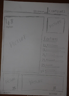
I then went onto sketching out my contents page doing the same; following codes and conventions but also challenging them by putting my own style into them. I decided to use more than two pictures on my contents page because my target audience are more attracted to looking at pictures than text therefore this will help to get them to read the different stories from the pictures instead of a long list of features which can be seen as slightly boring.
Lastly I sketched out my plan for my double page spread on the left side I am introducing the 'new upcoming artist' so I use a photo stretched across the page with the headline and subheading below then on the page across to that I am having the article down the left hand side and a block out with 'Twitterview' questions and answers. The background I am using a collage of photos which I have taken.


No comments:
Post a Comment