Wednesday, 7 November 2012
Evaluating Year 12
When I started year 12 media studies at A-level we was introduced to the two year course and what was expected of us. It then came to understanding the first brief given for our coursework. We was told the unit was based on music magazine and we had to complete a preliminary task along with the final product. We began creating a blog using Blogger to track through our developement. When given the breif in detail I understood what was expected as we also looked at last years work. From then onwards all of the lessons were relevent whether it was about codes and conventions, planning, researching or working on the Mac's creating our magazines. I feel we have the exact amount of both theory, independent and pratical lessons and we all was able to meet the deadlines with various drafts from critism and was able to correct these. If I had done something differently I maybe would of spent more time on writing my article. What I found difficult was coming up with a magazine completely unique and thinking of the ideas before putting it altogether. I enjoyed most working on Pages on the Mac's and Photoshopping all of my images. I was really pleased with my over all grade as I spent alot of time and effort, researching and planning in order to create it sucessfuly. I really enjoyed doing music magazine and wouldn't of wanted to do any other unit as I feel alot of people like music both male and female where as other magazines just cater for one gender. I spent some time at home researching and planning at home and taking the photos for my magazine however was unable to make my magazine as I didn't have the software.

Saturday, 7 January 2012
Question 7
Looking back at your preliminary task, what do you feel you have learnt in the progression from it to the full product?
I used Blurb Books to show what I have learnt in the progression from preliminary task to my media product. Not only have I learnt that research and planning is key when creating a media product but also the use of different technologies. I started by researching and analysing different music magazines and then used a variety of different websites to help plan and get feedback. Without Photoshop, Pages and various others I wouldn't of been able to make my final product at the standard it is at. Not only did I learn how to use different technologies but also I had to learn to write a good article for my magazine with edited versions.
Question 6
What have you learnt about technologies from the process of constructing this product?
Since September when I first started creating my school magazine, I have learn't to use a huge variety of different technologies on the MAC's at school and at home. Whilst constructing my product I have learn't to use programmes and websites such as Pages, Prezi, Slideshare, Flickr, Xtra Normal, iMovie, Blurb book, Photoshop, Photopeach, Photosnack and Blogger.
Since September when I first started creating my school magazine, I have learn't to use a huge variety of different technologies on the MAC's at school and at home. Whilst constructing my product I have learn't to use programmes and websites such as Pages, Prezi, Slideshare, Flickr, Xtra Normal, iMovie, Blurb book, Photoshop, Photopeach, Photosnack and Blogger.
When starting to construct my media product I had to take my pencil sketches and make a plan onto pages therefore I could start making my music magazine. I knew the basics of using Pages when I did media last year. This was good because I had a bit of a head start compared with some in my class. After I created my plan I had to start editing the plan. In my plan I decided I wished to make a collage of photos as the background of my double page spread. Below is the set of photos I put into pages and rotated them to look like a scrap book collage.

I then started to play around the different picture frames you can put around them. I found a variety of different frames that fitted in with my theme of a scrap book style which looked much better.

Once I had chosen the background for my second side of the double page spread I had to start creating my first page of my double page spread. I started with the name tag at the top and putting the picture I had taken in the centre. I asked a few class mates and they said they thought it didn't flow as a double page spread. The fact I had chosen to use a scrap book style I just didn't look like a double page spread with the neat black and white style on the first page. Therefore I decided to change my idea. This is when I used photoshop to cut 'Scott Kerner' out of the background and place him onto the collage background.

After learning to cut out a figure from the background in Photoshop I then copy and pasted him onto the collage background I had made on Pages. (Below)

I then started working on my front cover of my music magazine. I had the text boxes already and I had photoshopped my original photo using lens flare, brightness, contrast etc. I used these effects to make the photo fit in with the genre of pop, ibiza issue and summer.


Using Pages became alot easier over time as I started making changes to my music magazine to make it look better. I used a variety of different fonts I had chosen and fonts which are seen as associated with my genre. I made sure I stuck to a certain colour scheme which was bright neon green, yellow,black and white. This colours fit in well with the dance and festivals genre. I took out the photo I was going to put on my front cover as I felt the black and white image didn't fit in well on the front cover.


When writing my double page spread I knew that a key code and convention to start the text was to use a drop cap but I was unsure how you did this. Therefore I searched on Google and worked out how you did and it worked well on my double page spread. I got the hang of changing a variety of different settings for example on the text boxes I made them more opaque so that it looks more effective and it flows better than just a white box. The images behind the text which tell the story are still visible.
Question 5
How did you attract/address your audience?
I firstly had to decide who were my target audience. I decided that men and women were my target audience between the ages of 15-35, demographics D and E. Using this I was then able to decide how to attract my target audience correctly. I researched into my target audience but I already knew what exactly they want due to the fact I am part of the target audience. I researched into music magazines with the same target audience and idea as mine and found Mixmag. I closely analysed Mixmag and how they attract and address their target audience sucessful. I was able to see bright colours are key, along with the layout, contents, photos and text.
I knew that when creating my magazine it was key in immidatley attracting my target audience so I included bright colours on my front cover which then consistently followed through the magazine.I used a bright green which catches the eye and is relevant due to the Ibiza Rocks story on the main image.I also used a black, white and orange. I used a bright orange to contrast from the black and white and fit in with the summer theme. I took a variety of photos which back up a interesting and relevant story to my audience which will entice them to read on. Not only did I cleverly follow the layout of Mixmag but I made it by own by framing my own image and inserting a variety of different stories down the right hand side.
I noticed when going into my local store than alot of the music magazines use a hotspot to catch the readers eye and it is said to be successful with the audience of my choice. Any free goodies advertised entices the reader and from my research of my target audience on survey monkey it was clear it works. Also on my front cover I made it clear what other artists are included inside to appeal to a wider audience for the fans of these acts.
On my contents page I followed through with the colour scheme to make it consistent and proffesional. I chose carefully what photos to include and what to put on the contents page to entice the readers to carry on reading. I used photos with big page numbers therefore its easy to see what page it appears on. I chose to challenge a convention from Mixmag and put the competition on the contents page to show exactly what page you can 'win'. The competition I chose is relevant to the theme and the main picture and headline.
On my contents page I chose to use a theme of scrap book to fit in with the festival story. I used this theme to show how normal 'Scott' is and how his life is before all the fame hit him. I decided to use this as a story because readers like to read about down to earth people. I used 'Scott' as my model because it will attract girls and also boys. I designed my layout with inspiration from Mixmag double page spread. I think it looks really good and engages the reader. It looks scrappy but effective. I didn't use alot of text because my target audience don't like to read too much because it can become boring before you even start reading. I use a box out of general questions for the reader to get to know him alot more.
I think after all my researching and surveys I sucessfully attracted and addressed my target audience well.
I firstly had to decide who were my target audience. I decided that men and women were my target audience between the ages of 15-35, demographics D and E. Using this I was then able to decide how to attract my target audience correctly. I researched into my target audience but I already knew what exactly they want due to the fact I am part of the target audience. I researched into music magazines with the same target audience and idea as mine and found Mixmag. I closely analysed Mixmag and how they attract and address their target audience sucessful. I was able to see bright colours are key, along with the layout, contents, photos and text.
I knew that when creating my magazine it was key in immidatley attracting my target audience so I included bright colours on my front cover which then consistently followed through the magazine.I used a bright green which catches the eye and is relevant due to the Ibiza Rocks story on the main image.I also used a black, white and orange. I used a bright orange to contrast from the black and white and fit in with the summer theme. I took a variety of photos which back up a interesting and relevant story to my audience which will entice them to read on. Not only did I cleverly follow the layout of Mixmag but I made it by own by framing my own image and inserting a variety of different stories down the right hand side.
I noticed when going into my local store than alot of the music magazines use a hotspot to catch the readers eye and it is said to be successful with the audience of my choice. Any free goodies advertised entices the reader and from my research of my target audience on survey monkey it was clear it works. Also on my front cover I made it clear what other artists are included inside to appeal to a wider audience for the fans of these acts.
On my contents page I followed through with the colour scheme to make it consistent and proffesional. I chose carefully what photos to include and what to put on the contents page to entice the readers to carry on reading. I used photos with big page numbers therefore its easy to see what page it appears on. I chose to challenge a convention from Mixmag and put the competition on the contents page to show exactly what page you can 'win'. The competition I chose is relevant to the theme and the main picture and headline.
On my contents page I chose to use a theme of scrap book to fit in with the festival story. I used this theme to show how normal 'Scott' is and how his life is before all the fame hit him. I decided to use this as a story because readers like to read about down to earth people. I used 'Scott' as my model because it will attract girls and also boys. I designed my layout with inspiration from Mixmag double page spread. I think it looks really good and engages the reader. It looks scrappy but effective. I didn't use alot of text because my target audience don't like to read too much because it can become boring before you even start reading. I use a box out of general questions for the reader to get to know him alot more.
I think after all my researching and surveys I sucessfully attracted and addressed my target audience well.
Question 4
Who would be the audience for your media product?


The target audience for my magazine is male and females aged between 15- 35 years old. The audience of my music magazine is the same target audience near enough as Mix Mag. I chose to aim my magazine at this audience because I feel it is a wide ranged audience which has potential. There is no magazine out there that connects festivals/indie/dance/pop altogether therefore it appeals to a wide audience. I designed a survey using Survey monkey which I posted onto Facebook and Twitter. I posted it to my social network sites because this relates to my target audience. I collected my responses and analysed them carefully.
By looking at the response alot more males took part in my survey and nearly all were between the ages of 15-20. Over half of my responses said that the front cover appeals to them and stated because of 'bright colours' 'music genre' 'Reem' 'nice layout' etc. I carefully chose the artists on the front that I have included to fit in well with not only the genre but my target audience's most popular/famous artists. I used the mast head 'Just Reem' due to the fact over the past year the word 'Reem' has been used to describe how good something is. The word 'Reem' originates from club promoter, Joey Essex. I wanted to make my magazine up to date and modern with the new slang/colloquial language.
As the survey progressed I was able to see why my magazine appeals to them. Alot of people were saying, good price, good cover photo, the fact they get a free Example CD, competitions etc. These are all the codes and conventions which I used on my magazine to attract and appeal my target audience which has seemed to have been proven.
100% off all people surveyed said that they feel the magazine flows well which is key when creating and designing a music magazine. When asking whether the contents page appeals to them 6 out of 7 said yes.
Lastly I asked about my double page spread and if they did want to read it, why?. Alot of the response said it look interesting and explains it flows well with the genre of the magazine and has a good layout.


The target audience for my magazine is male and females aged between 15- 35 years old. The audience of my music magazine is the same target audience near enough as Mix Mag. I chose to aim my magazine at this audience because I feel it is a wide ranged audience which has potential. There is no magazine out there that connects festivals/indie/dance/pop altogether therefore it appeals to a wide audience. I designed a survey using Survey monkey which I posted onto Facebook and Twitter. I posted it to my social network sites because this relates to my target audience. I collected my responses and analysed them carefully.
By looking at the response alot more males took part in my survey and nearly all were between the ages of 15-20. Over half of my responses said that the front cover appeals to them and stated because of 'bright colours' 'music genre' 'Reem' 'nice layout' etc. I carefully chose the artists on the front that I have included to fit in well with not only the genre but my target audience's most popular/famous artists. I used the mast head 'Just Reem' due to the fact over the past year the word 'Reem' has been used to describe how good something is. The word 'Reem' originates from club promoter, Joey Essex. I wanted to make my magazine up to date and modern with the new slang/colloquial language.
As the survey progressed I was able to see why my magazine appeals to them. Alot of people were saying, good price, good cover photo, the fact they get a free Example CD, competitions etc. These are all the codes and conventions which I used on my magazine to attract and appeal my target audience which has seemed to have been proven.
100% off all people surveyed said that they feel the magazine flows well which is key when creating and designing a music magazine. When asking whether the contents page appeals to them 6 out of 7 said yes.
Lastly I asked about my double page spread and if they did want to read it, why?. Alot of the response said it look interesting and explains it flows well with the genre of the magazine and has a good layout.
Question 3
What kind of media institution might distribute your media product and why?
By: Leah Kerner
There are thousands of media institutions around the world but there are a few famous ones which sucesfully publish millions of different magazines whether there music magazines or not. In research and planning I researched different institutions using a video and was able to recognise various institutions, what they sell, how many, how often etc.
In October we as a class went to NME (IPC Media). When we visited we saw the process in which they use to make, distribute and sell all the different magazines they publish. The sucess was clear therefore I would use IPC Media as a company to distribute my media product. I would use IPC Media due to the fact they are a known worldwide for distributing the most successful and famous magazines for example NME, Marie Claire, TV Times, Look and many more.
I would think that IPC Media would distribute my magazine as they have not yet distributed a new dance/festivals magazine therefore there is a gap in the market for a new magazine. I would like to think IPC media would distribute my magazine because they are so successful and there aren't any magazines like mine with the same concept.
I would think that IPC Media would distribute my magazine as they have not yet distributed a new dance/festivals magazine therefore there is a gap in the market for a new magazine. I would like to think IPC media would distribute my magazine because they are so successful and there aren't any magazines like mine with the same concept.
Question 2
How does your media product represent particular social groups?
My music magazine I have made represents a particular social group which is my target audience as when I researched different magazines it clearly indicates the social group it is targeted at by the main codes and conventions. Alot of the music magazines use the front cover to appeal to there target audience which is obvious therefore I had to make sure my front cover was clearly targeted at my target audience.
To do this I carefully analysed what I had to do to make sure my front cover did this by researching into similar music magazines. I researched 'Mix Mag' and studied how they attract there target audience. Not only is the front cover a key in attracting the target audience, the price, contents etc also contributes to this.
For example I researched into the price of Mix Mag and saw that it is £4.20. It is believed although the price is high alot of people still buy it. Due to the fact its monthly they can charge this much because when I looked at the flat plan I was able to see how big Mix Mag really is. Therefore although they charge £4.20 it is seen as reasonable because it is once a month and is very big for a music magazine.
I preferred to follow the path of NME by producing a weekly magazine for the genre I have chosen. This is not yet on the market therefore I wanted to create a magazine different to any others. Although I have followed the style of Mix Mag I feel my magazine will be more up to date with news and events due to the fact it is weekly. I set the price of my music magazine at £2.20 because I feel that it is a reasonable price for my target audience.
My music magazine I have made represents a particular social group which is my target audience as when I researched different magazines it clearly indicates the social group it is targeted at by the main codes and conventions. Alot of the music magazines use the front cover to appeal to there target audience which is obvious therefore I had to make sure my front cover was clearly targeted at my target audience.
To do this I carefully analysed what I had to do to make sure my front cover did this by researching into similar music magazines. I researched 'Mix Mag' and studied how they attract there target audience. Not only is the front cover a key in attracting the target audience, the price, contents etc also contributes to this.
For example I researched into the price of Mix Mag and saw that it is £4.20. It is believed although the price is high alot of people still buy it. Due to the fact its monthly they can charge this much because when I looked at the flat plan I was able to see how big Mix Mag really is. Therefore although they charge £4.20 it is seen as reasonable because it is once a month and is very big for a music magazine.
I preferred to follow the path of NME by producing a weekly magazine for the genre I have chosen. This is not yet on the market therefore I wanted to create a magazine different to any others. Although I have followed the style of Mix Mag I feel my magazine will be more up to date with news and events due to the fact it is weekly. I set the price of my music magazine at £2.20 because I feel that it is a reasonable price for my target audience.
Question 1
In my book that I created in Blurb Bookify above I explain the ways in which my media product I have created used, developed and challanged forms and conventions of real media products. I closely analaysed Mix Mag magazine as they have the same genre and target audience. On the other hand my media product is slightly different therefore I challanged and developed various different forms and conventions seen on Mixmag.
Friday, 16 December 2011


Thursday, 15 December 2011
Magazines Instore

When actually making my music magazine I didn't know what to put on the top therefore I went into my local shop and I took a picture of the rack where all the music magazines are placed. I noticed that in order for a music magazine to catch the eye of the reader they use a hotspot at the top to show what 'free' things they are giving away or the tend to write the artists that are included to attract a wider audience. The logo is also key and they make sure there logo is big and bold to attract the eye of the reader making it clear that it is there magazine. Also on the front cover they use big and close up photos which use eye contact towards the reader. Therefore in order for mine to stand out and be better than any other magazine I have to make sure my logo is big and bold, the picture uses eye contact and to include a hotspot.
Thursday, 1 December 2011
Making Of My Music Magazine - Process
Making of My Music Magazine Process
I tracked my progress throughout making my music magazine and show what changes I made and why. It shows I got to my final product.
Edited Version - Double Page Spread Article
This time last year, Scott Kerner, 23,was a typical festival goer heading down south in an old bashed up minibus, packed full with a bunch of mates, all gearing up for Britain’s largest music festival weekend, Glastonbury! The whole weekend consisted of muddy camping, ALOT of drinks, girls and of course the fantastic line up that definitely never fails to please.
Never in a million years did Hopeful singer, Scott Kerner know what 2011 would bring him. Scott, played in various little clubs around the country leading up to summer 2010 along side his day to day job as a builder in London however A year on, Scott has been given an amazing opportunity to perform on the Pyramid stage at Glastonbury in front of hundreds of thousands, thanks to Example for having Scott as his special guest on his UK tour. He explains how mad his Twitter and Facebook has become and is shocked how quickly it has happened.
'Don't wanna sound too cringy, haha, but im just so happy to be able to perform on Saturday to such an amazing crowd of people who are just like me, travelling down to Glasto, wellies in hand, drinks, tents ah, I ain’t gunna become snobby I love my life, my mates, my hometown and FULHAM. Can't wait to perform mann, just wanna thank Example. Top man'.
It’s rumoured Scott will be performing to the crowd his new album, 'Never Ordinary' which contains dance classics with a unique and different twist that’s never been done before. We'll take your word for it! You are able to pre order Scott's album on iTunes now and it is released on CD Monday. Were looking forward to watching Scott's performance at Glastonbury 2011.
Wednesday, 30 November 2011
Photoshop Edited
Photo Edit 1


This is the image I have selected out of my various photos from the photoshoot. I wish to use this image on my front cover. Although the lighting was good I still felt it wasnt light enough and I could edit it to make it brighter to stand out alot more.Also having brighter lighting relates back to theme of partying. I used Photoshop on the MAC's to do this editing. I brightened the exposure of the photo which also brightened the Ibiza Rocks logo on her top which now contrasts alot more. I placed in a spot light and flare to emphasise the fact that Lucy Codd is the main subject of the story and magazine. I chose this photo out of all my other photos because I believe the angle of the photo and the eye contact is good because it looks really direct.
Photo Edit 2


I chose to use this one picture out of my variety that I took as I believe the angle of the photo is good because it doesn't show he is any bigger of smaller than anyone. Scott is rising to fame but is still the laid back boy from Surrey. In the photo I tried to show he doesn't feel any bigger and better than anyone because of his sudden rise to fame. The expression I caught shows his cheeky chappy side to his personality which portrays a true and loveable boy towards the reader. I chose to turn the photo into black and white because I have put it onto a very bright and vibrant collage of photos which If the photo was in colour he would lose the contrast and show that he is in front of these. By doing this I tried to portray the fact although hes the main subject in front of all these collage of photos, his festival and partying lifestyle is still there and will never be lost.
Tuesday, 29 November 2011
Pencil Sketches - Plans

I firstly created a pencil sketched plan of my front cover for my music magazine, I started creating and designing it by following the codes and conventions of a music magazine for example the mast head at the top. I looked at different magazines in shops and was able to see by using a hot spot in the top hand corner it attracts the eye of the reader and by putting in a freebie this persuades them to pick it up and buy it. I designed it follow the codes and conventions but also designing how I would want my own to look and reasons why it would look more effective.
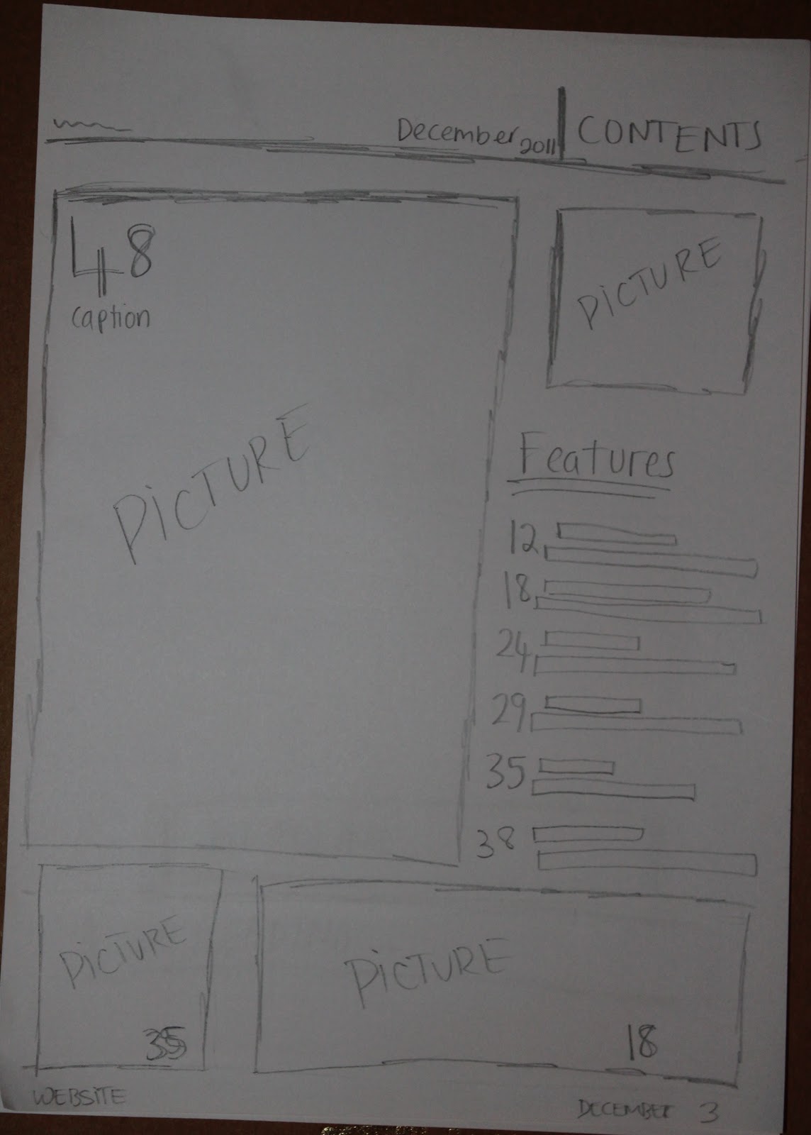
I then went onto sketching out my contents page doing the same; following codes and conventions but also challenging them by putting my own style into them. I decided to use more than two pictures on my contents page because my target audience are more attracted to looking at pictures than text therefore this will help to get them to read the different stories from the pictures instead of a long list of features which can be seen as slightly boring.


Lastly I sketched out my plan for my double page spread on the left side I am introducing the 'new upcoming artist' so I use a photo stretched across the page with the headline and subheading below then on the page across to that I am having the article down the left hand side and a block out with 'Twitterview' questions and answers. The background I am using a collage of photos which I have taken.
Monday, 28 November 2011
First Draft Of Double Page Spread Article
This time last year, Scott Kerner, 23 was a typical festival goer heading down south in an old bashed up minibus, packed full with a bunch of mates, all gearing up for Britain’s largest music festival weekend, Glastonbury! The whole weekend consisted of muddy camping, ALOT of drinks, girls and of course the fantastic line up of Glasto that definitely never fails to please. Hopeful singer, Scott, played in various little clubs around the country leading up to summer 2010 along side his day to day job as a builder in London. Little did he know what 2011 would bring him. A year on, Scott has been given an amazing opportunity to perform on the Pyramid stage at Glastonbury in front of hundreds of thousands, Thanks to Example for having Scott as his special guest on his UK tour. He explains how mad his Twitter and Facebook has become and is shocked how quickly it has happened. 'Don't wanna sound too cringy haha but im just so happy to be able to perform to such an amazing crowd of people who are just like me, travelling down to Glasto, wellies in hand, drinks, tents ah, I aint gunna become snobby I love my life, my mates, my hometown. Can't wait to perform mann, Just wanna thank Example. Top man'. Its rumoured Scott will be performing to the crowd his new album, 'Never Ordinary' which contains dance classics with a unique and different twist that’s never been done before. We'll take your word for it!! You are able to pre order Scott's album on iTunes now and it is released on Monday. Were looking forward to watching Scott's performance on Glastonbury 2011, remember Pyramid Stage BBC 2, Saturday 5.00pm, TUNE IN!
I decided to write out my double page spread article before taking photos because when we went to NME they stated that they firstly wrote out the article then took photos which are relevant to the story. This made sense and seemed a better idea therefore when it came to taking photos I knew exactly what I needed to do to back up my story. Also by doing this I realised how much space it would take up and how much space would it leave for the photos. This helped to know how many photos roughly I need to create my college.
I decided to write out my double page spread article before taking photos because when we went to NME they stated that they firstly wrote out the article then took photos which are relevant to the story. This made sense and seemed a better idea therefore when it came to taking photos I knew exactly what I needed to do to back up my story. Also by doing this I realised how much space it would take up and how much space would it leave for the photos. This helped to know how many photos roughly I need to create my college.
Monday, 21 November 2011
Mix Mag Interview
I was interviewed by Molly Mccambridge about Mix Mag; the institution, the magazines content itself and my views on the magazine. I have chosen to use Mix Mag as a magazine that I am analysing in depth as I am doing a magazine that is in the same genre and style.
Mood Board Interview
I was interviewed by Molly Mccambridge who asked me questions on my mood board that I had created therefore you are able to see what I like, what I don't, the different colours and what I would like to use in my own music magazine.
Saturday, 19 November 2011
Photo Shoot 2
I set up my photo shoot with the appropriate lighting and location and took a variety of successful photos of my model to appear on the front of my music magazine. I made sure the model was wearing the clothes I had planned, the makeup and hair. I uploaded the successful photos that can be used and posted them on my Flickr account and presented them on photo snack which I have placed below. I will then pick one to Photoshop and use on the front of my music magazine.
Friday, 18 November 2011
Photo shoot 3 Photos
Photo shoot 3 - Scott Kerner on Photo Peach
In Photo shoot 3 I took a variety of different photos of my brother in my house, All the photos I took are using natural light in order to create the natural look, I also got him to just look into the camera naturally and also doing crazy faces to show the other side to his laid back personality. I didn't use a specific background due to the fact I intend to use Photoshop to cut him out and put him into a different background. The majority of the photos I took have eye contact are from the shoulder upwards at an eye level angle to portray the fact hes just simply himself.
Photo Shoot 1
The first photo shoot I did was very natural with the use of natural lighting, movement, fun etc. At the festival I went to I took over a hundred of photos of the Scott that I wanted to appear in my double page spread in order for me to create a collage in a vintage style. The main boy I am using is my brother, Scott and he appears in every photo as the story will be on how he has gone along to the biggest festival of the year. The story will talk of him and his new album release and the stories before his big performance at Glastonbury. I took lots of photos throughout the festival in different places to show a story behind the whole experience of a festival with the current theme of my summer music magazine. I uploaded all my photos onto my Flickr account below,


Subscribe to:
Posts (Atom)